
Designing Email Signatures for Mobile-First Readability
A mobile-first guide for keeping signatures readable, tappable, and visually balanced on smaller screens without losing brand quality.

Email signature work is often treated like a finishing touch, but if a signature becomes cluttered or hard to tap on mobile, the sender looks less organized and the recipient is less likely to use the contact information provided. When teams that rely on mobile email reading and replies approach designing email signatures for mobile as a business system rather than a cosmetic task, they reduce rework, shorten onboarding, and protect every outgoing message from looking improvised. That shift matters because recipients notice small inconsistencies immediately: a cropped logo suggests poor coordination, a broken phone link slows down replies, and an outdated disclaimer creates avoidable risk. A strong signature program turns those weak points into a steady layer of trust that supports sales conversations, customer support, recruiting, and executive communication at the same time.
This guide is built around a practical idea: a mobile-first signature approach that stays useful on small screens without feeling stripped down. Instead of chasing design tricks or copying whatever another company pasted into Gmail, the better route is to define a repeatable operating model, confirm which fields truly matter, test on the email clients your team already uses, and create a light governance rhythm that keeps everything current. That is the purpose of a mobile-first signature design model: a way to connect branding, usability, compliance, and execution so the signature stays useful after launch rather than looking good for one week and then drifting out of control.
Design for fast scanning, not for decorative density
The first conversation should not be about fonts, banners, or icon styles. It should be about the operational promise behind the signature. Mobile-first work begins by accepting that recipients scan quickly, often between tasks, and usually give the signature only a few seconds of attention. That means identifying who owns the master template, which teams need a variation, which fields can be personalized, and where the signature should actively help a conversation move forward. When those questions are skipped, people compensate by making local edits, and local edits are usually the fastest path to visual drift. Starting with governance sounds less exciting than starting with design, but it is exactly what allows the design to remain consistent after the first rollout.
Requirement gathering works best when it is specific and slightly uncomfortable. That makes prioritization essential: the first lines must communicate identity and one useful action without burying the reader in secondary details. Ask stakeholders to point out the information recipients actually use, the elements that regularly become outdated, and the details that should never be touched without approval. That conversation usually reveals hidden complexity: regional phone formats, temporary campaign links, recruitment banners, holiday schedules, or legal clauses that vary by market. Once those realities are documented, the signature stops being an abstract brand asset and becomes a manageable operational product with clear constraints.
- Stacking too many links so the signature becomes taller than the useful part of the email.
- Using tiny text or cramped spacing that makes phone numbers difficult to tap accurately.
- Trying to reproduce the full desktop experience without accepting mobile constraints.
Reduce the layout to what mobile readers can use quickly
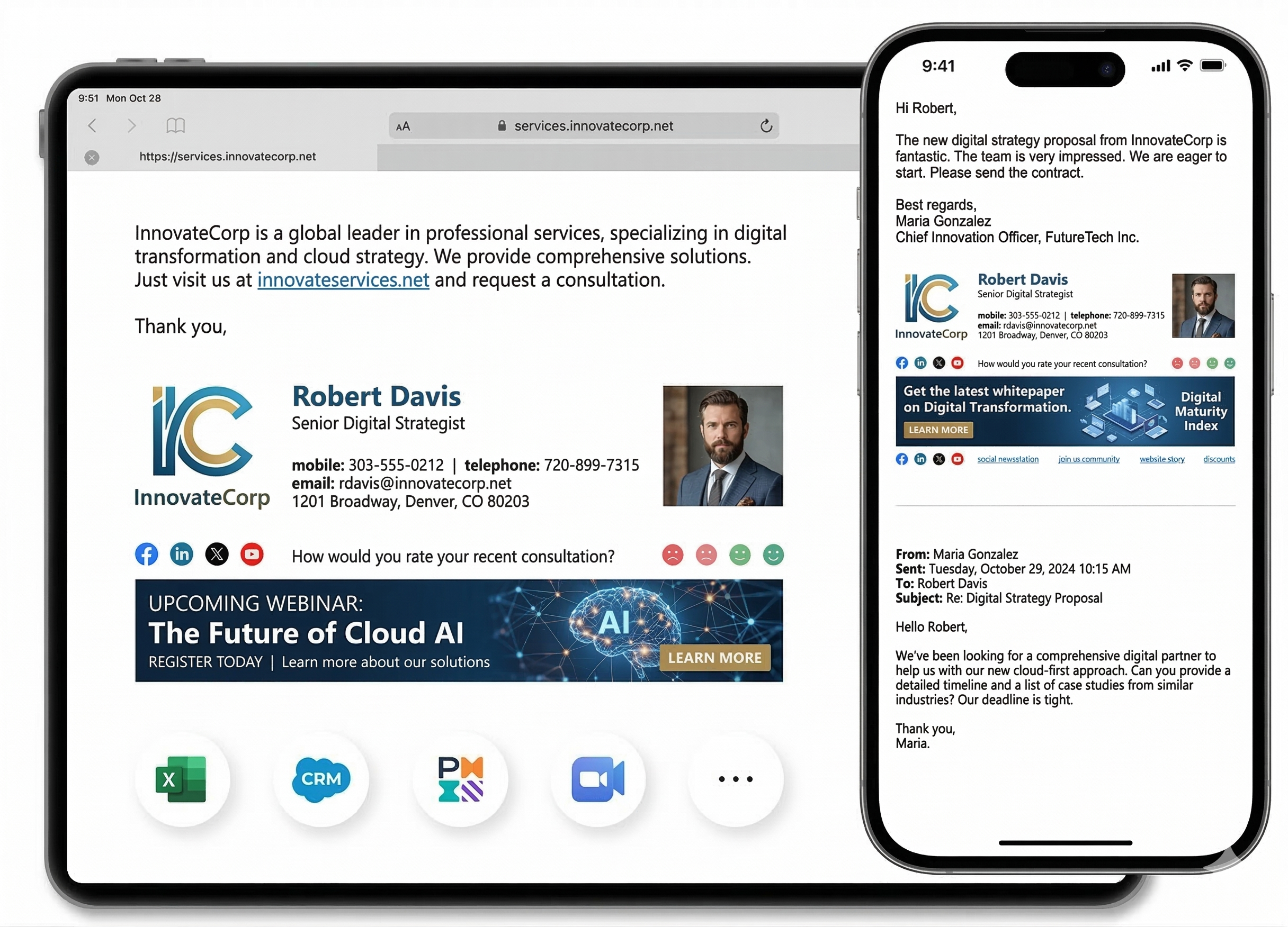
A reliable signature layout is less about decoration and more about disciplined hierarchy. Spacing, line length, and vertical rhythm matter more on mobile because even small misjudgments can push the useful content below the first glance. The strongest versions make the name easy to find, the role easy to understand, and the primary action easy to scan without forcing the recipient to interpret a crowded block of links. Visual restraint is useful because the email body already carries the main message; the signature should support credibility and provide a small next step, not compete with the content above it. Teams that respect hierarchy usually end up with signatures that travel better across Gmail, Outlook, Apple Mail, forwarding chains, and mobile replies.
Content choices matter just as much as layout choices. The best mobile signatures remove anything that does not earn its place, especially repeated links, long legal blocks, and decorative imagery with no clear value. A signature becomes more persuasive when every line earns its place. If an item does not help identification, contact, compliance, or conversion, it is probably consuming space that could be used more effectively elsewhere. This is also where imagery needs discipline. A headshot, logo, or campaign banner should clarify identity and create recognition, but it should never slow loading, dominate the message, or create awkward empty blocks when images are blocked by the email client. Thoughtful restraint improves both aesthetics and performance.
Explain the logic so teams support the simpler model
Even the best template fails if employees cannot use it confidently. Users should understand why some desktop-friendly ideas are intentionally reduced in the mobile version, otherwise they often request additions that weaken readability. Good enablement means a new hire should understand how to generate, install, and verify a signature in minutes, not after a string of internal tickets. The workflow needs to explain what can be edited, what is locked, and where to go for help if something looks wrong. Teams often underestimate this part because the template feels finished once the design is approved. In practice, the success of a signature program depends heavily on whether everyday users can reproduce the approved version without having to interpret unwritten rules.
Edge cases are the fastest way to expose whether a process is genuinely ready. International dialing formats, long job titles, bilingual names, and CTA labels that wrap unpredictably all need deliberate decisions. A mature setup anticipates those moments before launch and includes fallback guidance that is short enough to be followed under time pressure. That is why support copy matters: concise internal instructions, screenshots, and one escalation path prevent people from improvising fixes that create even more inconsistency. The goal is not to eliminate every exception. The goal is to make exceptions boring, predictable, and easy to recover from without weakening trust in the template itself.
Test tap targets, wrapping, and first-screen visibility
Quality assurance deserves its own slot in the rollout timeline because email signatures break in ways that static mockups never reveal. Mobile QA should focus on tap targets, readability in sunlight or low attention conditions, and whether the most important fields appear before the signature feels too tall. Test messages should be sent to real inboxes, forwarded internally, viewed on different screen sizes, and opened with images blocked as well as enabled. That process reveals spacing problems, alignment shifts, logo distortion, CTA visibility issues, and legal text that becomes unreadable once the email client applies its own defaults. QA is not an admission that the design is fragile. It is the discipline that turns a promising layout into a dependable production asset.
Testing across different phones and email apps matters because touch behavior, scaling, and image loading can vary more than teams expect. The practical lesson is simple: if one client matters to your organization, it deserves its own acceptance criteria. Teams get into trouble when they validate only in the environment preferred by the person building the template. A healthier habit is to define a small but non-negotiable testing matrix and use the same one every time the signature changes. That habit shortens future reviews because people stop debating what good looks like; they already have a clear benchmark for passing or failing a release.
- Check how many lines are visible before the user has to scroll.
- Validate tap behavior for phone numbers, websites, and CTA links.
- Compare the signature in more than one mobile email app before approval.
Protect mobile clarity through governance choices
Once the signature is live, governance becomes the difference between a polished system and a slowly decaying one. Mobile-first governance often means limiting optional modules and giving the design owner authority to reject additions that would overcomplicate the first screen view. The healthiest setup gives people enough flexibility to keep their own contact details current while protecting the structural elements that carry brand and legal risk. That balance keeps employees productive without opening the door to constant redesign from department to department. Governance is most effective when it feels ordinary: one owner, one review cadence, one change log, and a short path for campaign or compliance updates.
That decision is easier when product marketing, sales, and support agree that clarity on small screens is more valuable than squeezing every possible asset into the signature. This is especially important when responsibilities span marketing, operations, customer success, and regional teams. If ownership is vague, updates stall until a problem becomes visible in customer emails. If ownership is explicit, improvements happen quietly and the signature evolves without drama. That is the standard worth aiming for: a signature program that supports day-to-day communication so smoothly that most employees barely think about it, while leadership still knows it can be updated quickly when the business changes.
Review real usage instead of guessing what matters
Measurement closes the loop and proves whether the signature is helping the business or just decorating it. Review whether phone links are used, whether CTA taps remain meaningful, and whether users report readability or installation issues from mobile-centric teams. The right review does not obsess over vanity data. It compares expected behavior with real behavior: are employees actually using the approved version, are recipients clicking the right CTA, are support teams seeing fewer setup problems, and are updates reaching every market without lag. When those signals are reviewed consistently, the signature becomes easier to defend internally because it is tied to outcomes, not just personal taste or brand preference.
Improvements usually come from tighter hierarchy and better spacing, not from trying to miniaturize a desktop-heavy design. A useful cadence is a monthly operating review with a deeper quarterly refresh. Monthly reviews catch fast-moving issues such as broken links, seasonal campaigns, or low adoption in a specific department. Quarterly reviews create space for bigger questions around layout, localization, device behavior, and whether the signature still reflects the company you are becoming. Iteration works best when it is deliberate. Random edits create noise; structured reviews create compounding quality.
- Tap quality on the key mobile contact methods.
- Readability feedback from teams that work heavily from phones.
- Frequency of spacing or wrapping issues reported after rollout.
Final takeaway
A good mobile-first signature is not missing information. It is showing the right information at the right moment for the device where attention is shortest. The central idea to keep is that a signature succeeds when it feels effortless to the sender and reassuring to the recipient. That combination comes from operational clarity more than visual novelty. A thoughtful system gives teams confidence because they know every message leaves the company looking aligned, credible, and ready for the next action.
If you are updating this part of your email experience now, start small but start with the full system in mind. Define the owner, simplify the template, test the environments that matter most, and document how changes will be reviewed. Those steps may look simple, yet together they create the durable advantage most teams are actually looking for: signatures that are easier to manage, nicer to read, and strong enough to support the brand every single day.